Featured Products
-
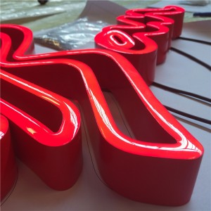
OEM China Custom Design High Brightness 3D Plastic Acrylic Alphabet Letter Sign
In life, we can often see all kinds of signs, these signs can guide us in the right direction, and can also become a sign of important areas. To achieve these purposes, it is necessary to carry out special identification and signage production, and good identification and signage also need to meet the corresponding standards. Here is a reputable signage maker to describe what standards signage should meet.
1. Welding standards
The production of signs shall meet the welding standards. To this end, after the design of the shape, it is necessary to weld according to the shape, the defects need to be completely removed before welding, and the weld surface should also be smooth and smooth without sharp corners, after the completion of welding, the welding meat should be full and the welding surface has no burns, cracks and significant nodding, the entire weld appearance should be beautiful, there is no bite, slag, porosity, cracks, spatter, and other defects. -

China Gold Supplier for Custom High Quality 3D LED Outdoor Business Signage LED Letter Sign Acrylic LED Channel Letter
The advantages of luminous resin letter sign: strong weather resistance, color persity, uniform light; The use of LED light has the advantages of energy saving, resin selection can be perse with persity, daytime and night effect can maintain consistency, long service life in the outdoors with weather resistance.
-
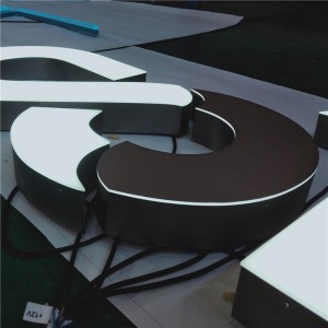
factory Outlets for Beautiful High Brightness LED Channel Words Facelit Shopfront Signage Display
The sign is more inclined to have the main function of civilization mark and warning in itself. Most of these styles in the text can be directly used to express or describe a person’s true character and meaning. Form and other graphic symbols can also be widely expressed as expressing a special symbol and a special meaning with a constructivist nature.
Sign advertising is a kind of new media conveyed through the form of information, which usually has the display function of product advertising. Your brand image effect can be redesigned, planned, integrated, and optimized so that your brand image effect can be improved to a greater extent and achieve visual unity.
In the sense of this word, the acceleration of industrialization of the logo packaging equipment products performs an important technical function with industrial and industry-leading role, with the continuous expansion of modern urban infrastructure needs, to the main brand Chinese enterprises main business concept of the overall construction plan as the main design theme; The main design theme is the main content of the business activities of the main brand and the main business activities of the main brand Chinese enterprises, as well as the overall design appearance and interior decoration design of the product; The main design theme is the use of the overall combination of the Chinese name of the main brand, the English name of the brand and the English prefix of the brand.
-

Professional China Custom Outdoor Store Front Signs Board 3D Resin LED Sign
There are many sign manufacturers, if you want to be reliable, the production and installation are still more standardized, and the construction safety measures are more in place. At that time, the corporate sign was still difficult to make, curved floor toughened glass, and metal floor frames could be customized, and the glass sign factory was a sign manufacturer, used to make large commercial company signs, residential signs, office signs, hospital signs, scenic spot corporate signs, school signs, office building signs, municipal department signs.
The whole design team of signage manufacturers in the complete and scientific product quality assurance management system guidance for our customers to provide a complete set of integrated product identification system design solutions. For this sheet metal manufacturing process, people must first do a good job of sheet metal material standard measurement, grasp the various technical parameters of sheet metal material, and calculate the consumption of material identification or signage. Sheet metal treatment processes can also include calibration, polishing and heat treatment, oil removal, corrosion prevention, etc. There are two treatment methods: water plating and double-layer vacuum thermal plating.
-

New Fashion Design for Custom 3D Embossed LED Frontit or Backlit Light Box Sign
Due to the many advantages of acrylic, acrylic products are very popular with the public, the more beautiful things, the more exquisite technology is needed to complete. Therefore, the production of acrylic signs needs more skilled processing masters to make good products, in the process of making signs to make reasonable use of various factors. The key factors that reflect the characteristics of the logo enable the logo to play its due role, to ensure that the advantages of acrylic signs are fully played, the design and production must pay attention to a lot of things.
1. Pay attention to the design should apply to aesthetics
The value of signage lies in the place of people, and logo design and production should not be based on personal and self-subjective wishes. The audience should be fully considered before the design and production, and the logo design should be in line with people’s visual habits. The design of acrylic signs must be a reasonable use of color do not use too much color so that the viewer will feel dazzled. According to relevant scientific experiments, if a person wants to have a long-term memory of something, he must be constantly subjected to external stimuli and repeated impressions, and the brain is easy to forget. Regarding advertising words, relevant statistics also confirm that the effect of the repeated push of the same advertising words will be significant.
-

Renewable Design for China Custom Interchangeable Aluminum Curved Door Floor Directional Guiding Building Nameplate Plaque Plate Sign Signe Signo Zeichen Sinal Znak
Advertising signage in the eyes of some customers is regarded as an important publicity channel, The lack of assistance of signage will hinder the advertising work, which is a fact that customers do not want to witness, so they will focus on related matters. This behavior of the customer shows that they are more interested in the dial, and at this stage is in an important screening period, and the details that are easy to miss have to be integrated into one place to establish an accurate design direction.
1, Confirm the specific size and quantity of signs
It is not difficult to obtain advertising signage that can continue to receive high praise, and many times the reason why it is not met is that the customer’s screening direction of the sign is not detailed enough in the early stage, and the scope of coverage is inappropriate. One of the measures included is to establish the specific size and number of customers for the dial, and there are not a few customers who ignore this step and need to adjust their thinking.
-
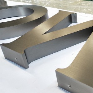
Competitive Price for Acrylic Lightbox Sign Outdoor LED Signage Hanging Light Box
Whether the responsibility of advertising signs can be recognized by customers, needs to see the true attitude of customers toward the sign, and the degree of understanding of this sign, various factors will interfere with the customer’s purchase of signs. If the intended customer purchased this design service and perceives that the logo and signage presented are far from the actual requirements, this will increase the customer’s disappointment, not conducive to the two sides cooperating again, The customer will also review the design matters.
1. The advantages of the sign are not confirmed in advance
One of the reasons for the inconsistent advertising signs and requirements is that the customer cognition is shallow, although the customer ordering the service is not responsible for the design work, but if you do not understand the advantages of clear signs, it will interfere with the screening idea. In other words, if customers want to tap into the intrinsic value of the sign itself, they need to master its outstanding advantages.
-
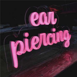
Cheapest Price Most Popular Acrylic Logo Channel LED Sign with Flex Stripe or Glass Neon Tube
The maintenance of the light signs after installation is very critical, if not maintained, it is easy to cause damage to the light signs and the occurrence of non-luminous phenomena, then we should pay attention to these aspects in the later maintenance:
1. Whether it is indoor or outdoor, it is very important to regularly remove the debris on the luminous signs. Do not use things with water when wiping, remember to use dry, soft things to remove debris.
2. When cleaning, you can use water or a neutral cleaning agent, not suitable for too much cleaning agent, especially can not use gasoline to clean the surface dirt of the luminous sign, so as not to cause damage to it. After wiping, wipe the surface of the luminous sign with a little polishing wax to increase the degree of brightness. -
Factory Price For China Wholesale 3D Backlit Signage LED Business Signs for Billboard
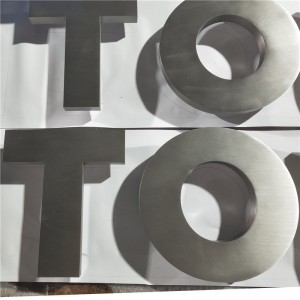
Stainless steel channel letter sign is a common advertising sign, with rust, corrosion resistance, strong weather resistance and other characteristics. It is made of stainless steel material and processed by cutting, bending, welding and other processes. Stainless steel channel letter signs have the characteristics of flexible design, professional and beautiful appearance, and are gradually widely used in the field of commercial advertising.
First of all, stainless steel channel letter signs have excellent weather resistance, can be used for a long time in a variety of harsh climatic conditions, do not easily rust, not by acid alkali and other chemical substances erosion. This makes stainless steel channel letter signs perform well in outdoor advertising signs, road signs and other occasions, and its beautiful appearance can remain unchanged for a long time.
-
100% Original Factory Outdoor Electronic Signs LED Letters 3D Channel Sign Backlit Logo
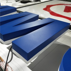
Painted backlit signs have become the first choice for many high-end brands for the following reasons:
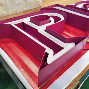
Unique appearance design: Paint backlight signs through the paint treatment, can present a high texture of the smooth surface and rich color choices so that the logo has a unique appearance design, can attract the attention of customers, and increase brand recognition.
High-quality materials: paint-backed luminous signs are usually made of high-quality luminous adhesive paper, which is waterproof, sunscreen, and corrosion-resistant. This material can not only maintain the long-term durability of the sign but also maintain a clear and bright display effect in different environments.
-
OEM Manufacturer LED Neon Light Neon Sign Popsicle Lamp Battery Box for Ice Cream Shop Pastry Display Restaurant Bar Holiday Decor Sexy Sign
In daily life, people can not do without the guidance of signs, and the role of different signs is not the same for people. Signs such as road signs are extremely helpful and meaningful. Maybe people haven’t realized their significance yet, but just imagine removing all directional things, and people’s sense of direction and cognition of the world might be blurred.
Street signs, for example, have a history of nearly 100 years, during which time their performance and production have undergone many changes. From early road sign advertising to painted road sign advertising, road sign advertising from its birth to today, its media characteristics have been consistent. Its characteristics are set in the downtown area, the location is relatively good, and there are more pedestrians, so the advertising effect is relatively strong. Therefore, the specific environment of the road sign is the road, and its object is the dynamic pedestrian, so the picture of the road sign is mostly in the form of text and text. The picture is eye-catching, the text is refined, the three-dimensional sense is strong, the charm of the product is reproduced, the city image of the product (brand) is more effectively established, and the communication is convenient in the later period. The materials used also have the function of rain prevention and sun protection.
-
Hot-selling Factory Custom Made Gold Plated Metal Alloy Name Badge Manufacturer Customized Company Logo Label Bespoke Rectangle Metallic Brass Brand Insignia Tag and Sign
As a consumer, if you want to obtain information about related products, you can start from friends’ recommendations, online advertising, platform activities, etc., but for most people, among the ways to learn about stores or brands in a short time, advertising signage can be regarded as one of the shortest and fastest ways to understand. People can see the service, goods, and the personal style of the operator from the logo, to know whether they have the desire to enter the store for consumption.
During lunch break or after work, people will choose to make an appointment with their good colleagues or former friends to sit in nearby stores and chat and share recent news. Some people will choose to search for stores with relatively high ratings on the platform first, but most people will choose to search for small but interesting stores nearby. At this time, they can see the items that may be provided inside from the signs outside the stores. To reduce customer inquiries, some stores will also paste today’s menu outside the door, so that guests who choose to enter the door have a greater possibility to choose to leave the experience.
-
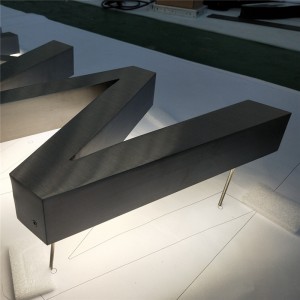
Big discounting Backlit Signage Acrylic LED Backlite Signs
How to use signs to make the scene more beautiful?
1. Create visual differences
The so-called visual difference is based on a certain color contrast, for example, in the science and technology museum, the overall tone is based on white or future color, then in the sign design, the choice of color should form a sharp contrast with it, so that you can be clear at a glance in the huge space, closer to their destination. This visual difference in signage can better highlight the characteristics of technology.
2. Use space to create identity architecture
In the large outdoor space, the pylon is a landmark building, which reflects the artistic elements in the environment from the artistic point of view, and adds the cultural background of the environment from the cultural point of view. Therefore, whether it is in the square of the enterprise or a large park, the sign has a guiding function, and a pylon with both art and culture can not only become a landmark building, but also bring different colors to the surrounding environment, and play a complementary effect.

